Beautiful Interior Design Ideas for Small Spaces
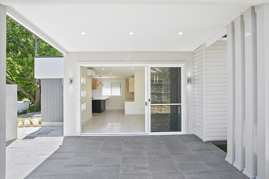
When people hear the words, “Granny Flat”, interior design is rarely the first thing that comes to mind.
Putting ‘granny’ in the name often detracts from the reality that building a new granny flat is an opportunity to create something fresh, innovative and exciting.
Though a granny flat may be a small building, it doesn’t have to be an old, boring, boxlike addition in comparison to your house. We are big believers in incorporating fresh design and architectural features so that your granny flat does nothing but improve your property and enhance the design features you already have.
Regulations do, however, limit the size of granny flats to a maximum of 60m2. This means that you will need to use smart and clever design strategies to get the most out of your space without making it feel small.
Small is not always bad either. The size of granny flats makes it quite easy to turn them into eco-homes that are self-sustaining (and you can read more about that here). The trouble only comes when the space FEELS small.
Top 5 tips for using interior design to make your space feel bigger
1. Build-in as much as you can
If you can build things into the granny flat, instead of having to add them later as furniture, you will make your space appear less cluttered and more open. This is particularly important for storage. Built-in wardrobes may take up the same space as furniture alternatives, but a built-in wardrobe will make a room feel bigger than one with a standing wardrobe in it.
This is the same with cupboards, cabinets and even laundry features. Something as simple as having a clothesline outside, or a fold-down ironing board from a cupboard door will help you avoid having a clothes horse and ironing board taking up essential floor space.
2. Leave spaces as open as possible
Think high ceilings, open living plans and large windows and doors. Use essential furniture to ‘zone’ spaces.
For example, use the lounge chair and coffee table strategically to create a separation between the lounge and dining areas, rather than a wall that will make the space feel closed in.
3. Let the light in
In a small space, natural light is your best friend. Light from outside makes spaces feel big, while darkness has the opposite effect. Windows and doors aren’t just good for leaving spaces open – they are a major feature that you can use to let in light.
You can also use skylights, voids and glass panel features in walls or doors to enhance the amount of natural light your granny flat gets.
4. Use white or bright colour pallets
These colours reflect the natural light and will also help make the space feel open and big. A room with dark walls will feel much smaller than one with lighter, brighter colours.
You can include this fundamental principle of ‘white and light’ in your kitchen and include some reflective surfaces to increase the light factor even more.
5. Keep it simple
Trying to pack too much into one space is a sure-fire way to draw attention to the size and make it feel small. This design rule goes for everything from kitchen cabinets to furniture choices. Intricate cabinetry may look beautiful in a display home kitchen, but in a small space, it can feel busy and overwhelming. A minimalist approach that uses handle-less or smooth surfaced kitchen cabinets will help emphasize the feeling of spaciousness.
If you want to delve deeper into specific design features that will help make your space feel bigger, we have an entire list of 26 ways to make the most out of your 60m2 granny flat here.
If you are looking for more ideas that you can add to your granny flat design Pinterest board, or to inspire you, here are some examples of masterful granny flat designs we’ve provided for some very happy clients.
Interior Design Ideas for Small Spaces
Woolooware
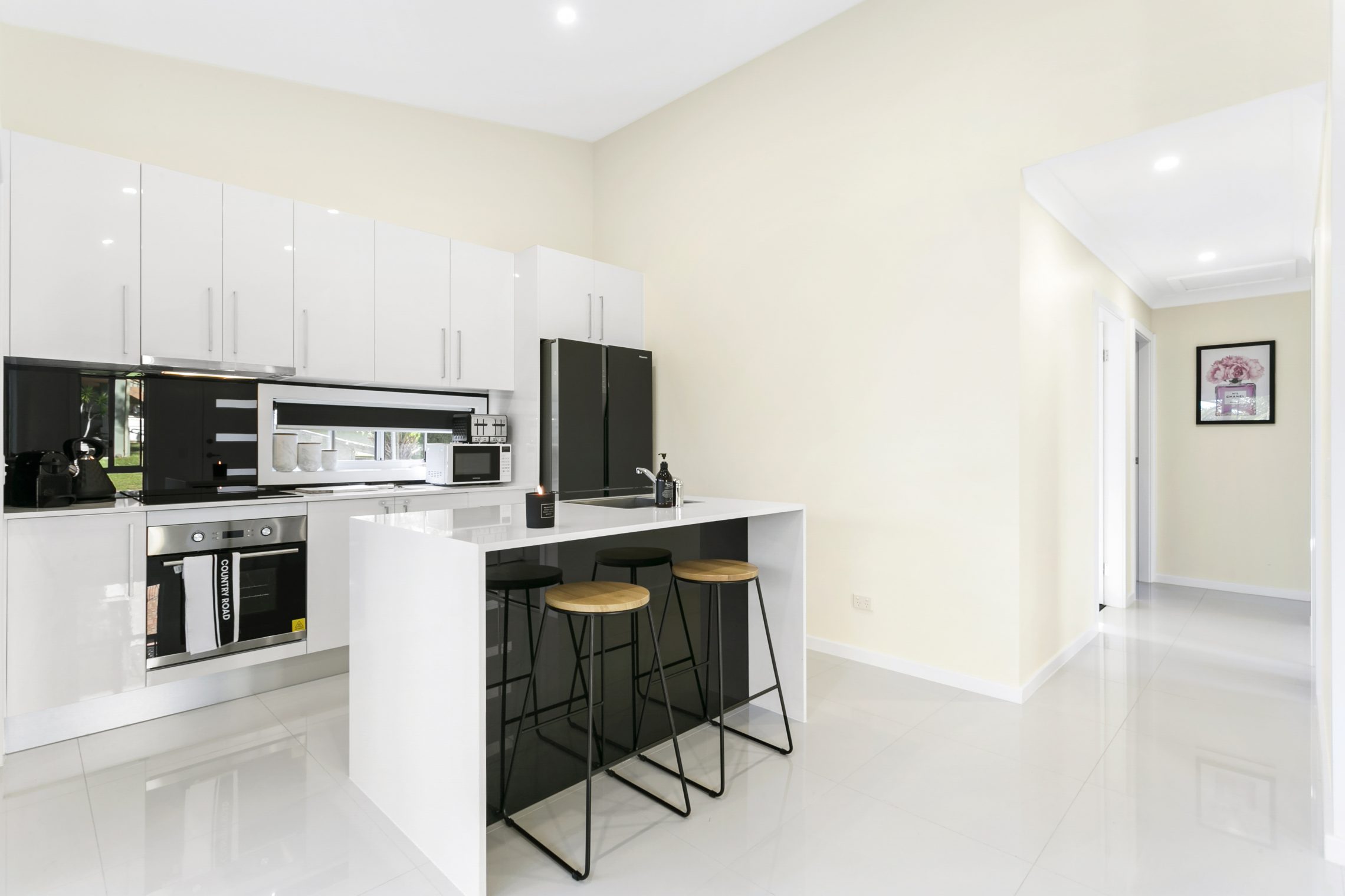
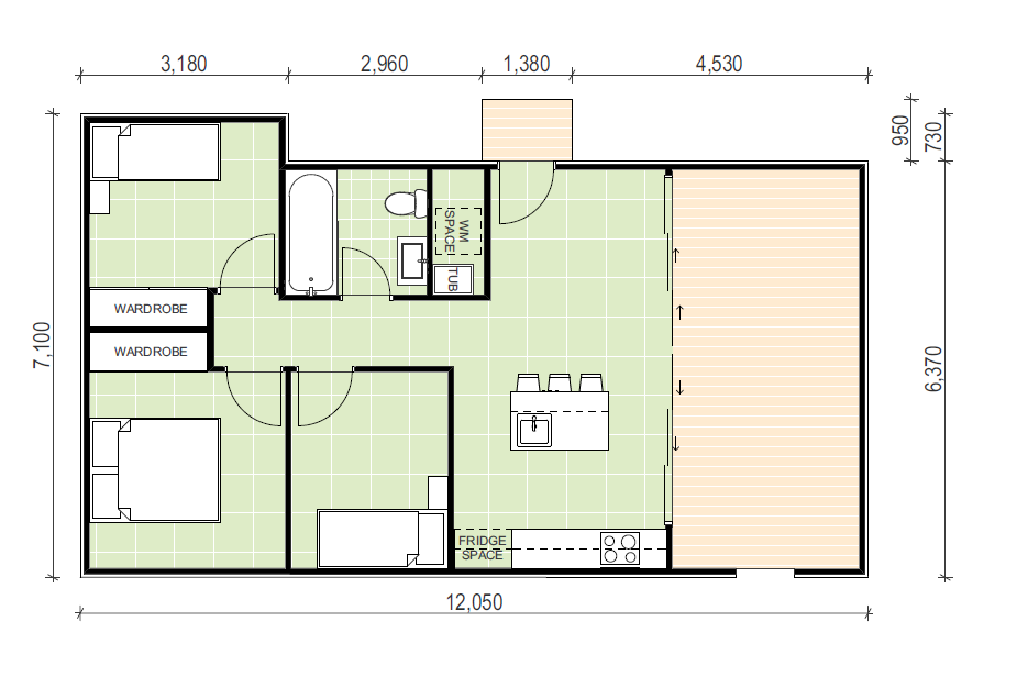
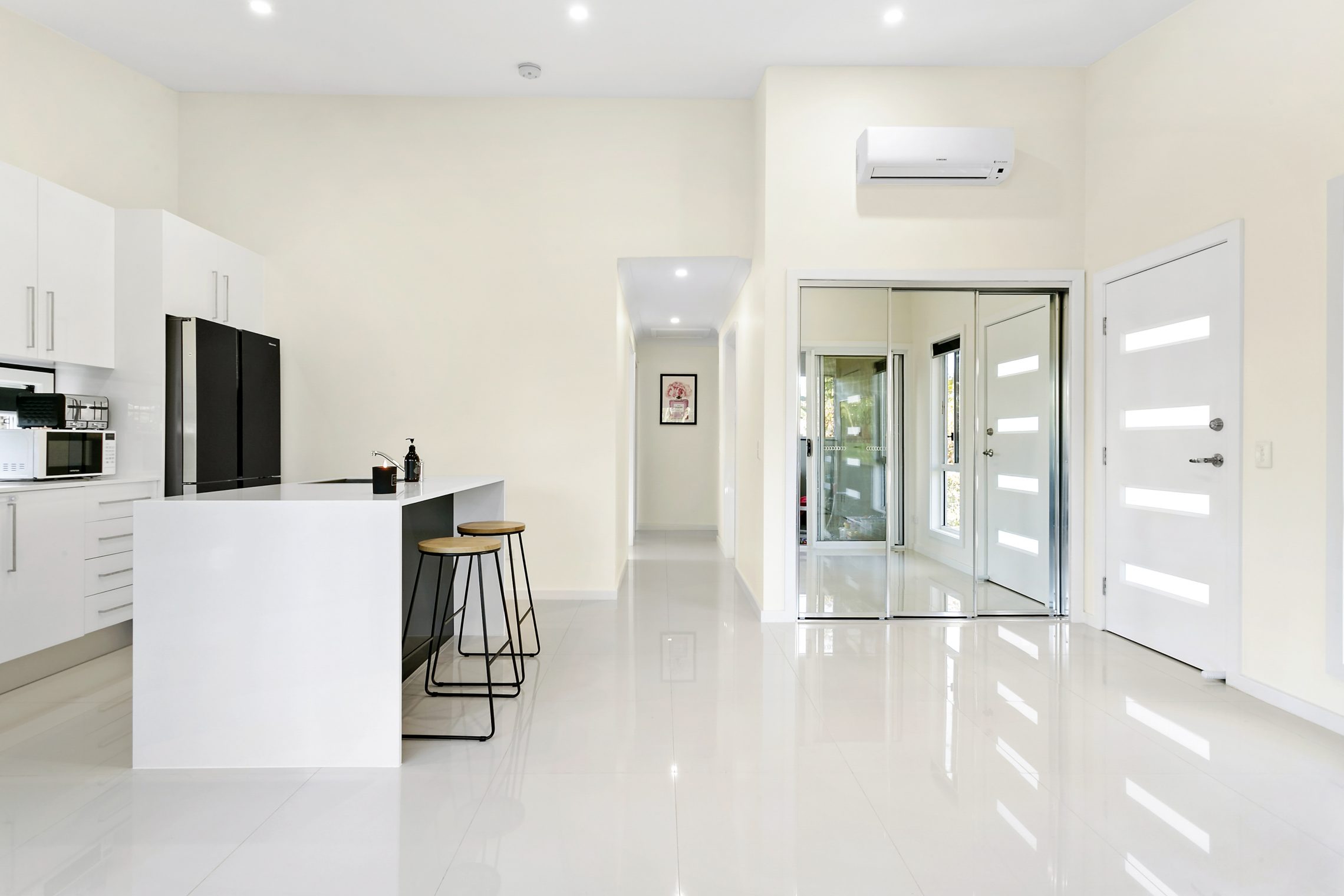
Woolooware is an excellent example of how to make the most of your space. Although it is restricted by the 60m2 limit, there are 3 bedrooms, and the space still feels open and large.
While there are a lot of clever design tricks we used to make this flat feel spacious, there are two main design tricks to draw inspiration from:
- The design style of this minimalistic kitchen is a superb example of how using simple colours and finishes can still look modern and high end. We used a white colour pallet with pops of black to give it balance. The white increases the light to make it feel bigger, while the black creates a sense of elegance and sophistication. Where black was used, you can see that it has a reflective finish to bounce the light off, also helping to increase the amount of light. Even the floor tiles are white and glossy to make the space feel open.
- The floor plan incorporates large sliding doors onto an outdoor area. Your outdoor spaces do not count in the 60m2 granny flat footprint, so using a layout like this is a clever way to increase your entertaining and living areas and make the area feel much larger. As you can see in this example, it has more than doubled the ‘living’ space available.
Other size enhancing features you can see include many windows, high ceilings, and mirrors. While it is still the size of a granny flat, the space created by this clever use of design and finishes makes it feel much larger than a regular flat.
West Pennant Hills
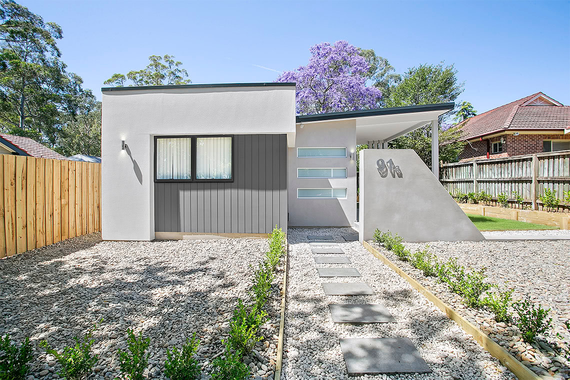

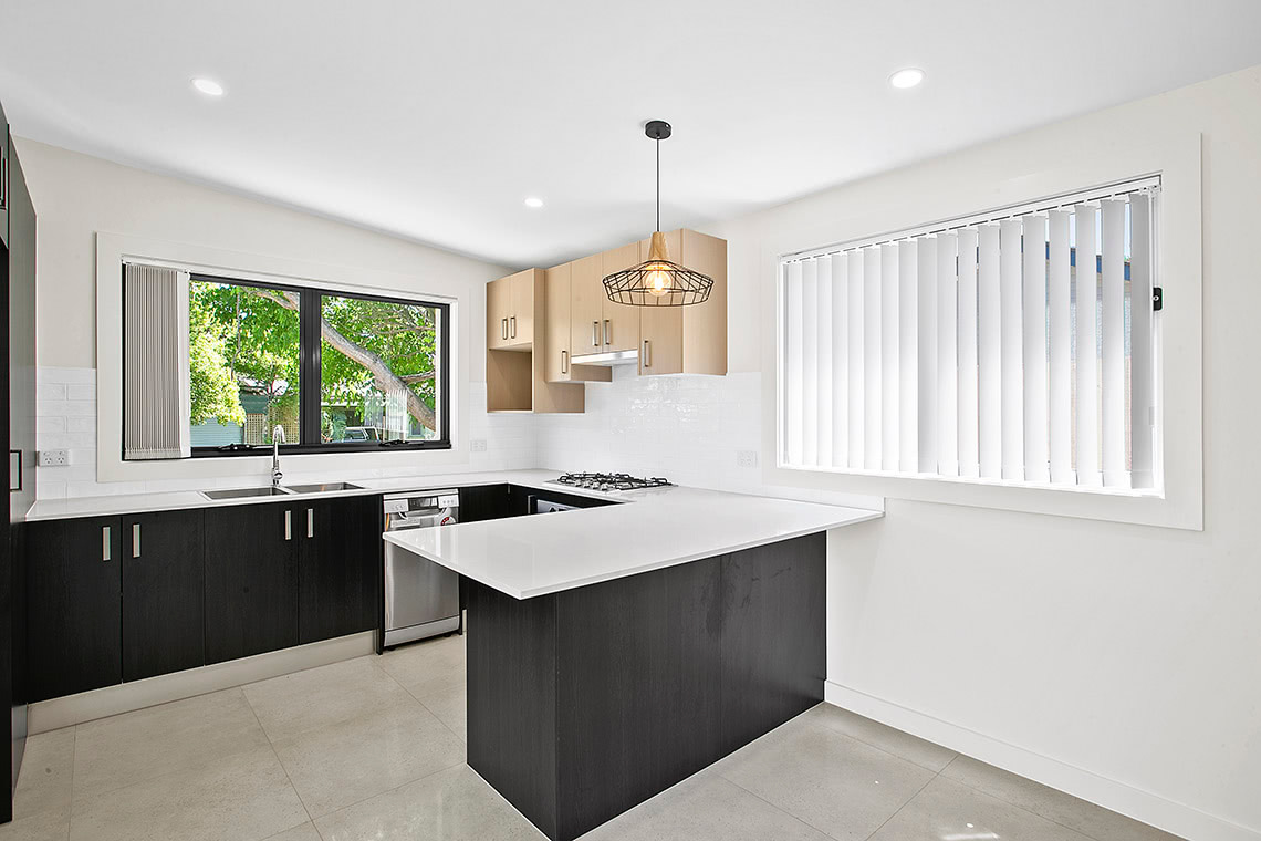
West Pennant Hills’ granny flat is our most recent award-winning granny flat design. The judges of the Master Builder Award were most impressed with our use of space, with bells and whistles you wouldn’t normally see in a granny flat (like a walk-in pantry and wardrobe!), all while maintaining a feeling of luxury and space.
- One of the things we did to keep a feeling of space was the clever use of extra windows for light. Even in places where a window may have seemed impractical, we used frosted glass to increase the natural light with no effect to privacy.
- We also used the large sliding doors into an open outdoor space to increase the liveable size of the area, and make the space feel bigger.
- This granny flat also used built in features to increase the sense of space. Building in a study nook like this, rather than putting in furniture, was one of the ways we made the space feel bigger. Alternatively, adding a desk and bookshelf would have taken up much more space, and by being built into the wall, the desk connects to the space in a way that gives the impression of more room in comparison.
Both the Master Builder judges and our happy clients were impressed with how much we could do in such a little space, while still making this granny flat look stylish and spacious.
If you are considering building a granny flat and need more help or inspiration for your interior design, give us a call and speak with one of our friendly granny flat experts today.
Ready to start your building journey? Chat to our team of experts today and get a FREE personalised quote
Find Out More
“Experience the difference for yourself.”
Call now to book your obligation free site inspection and quote with our friendly staff.


